I get inspired from a number of places. I subscribe to many magazines - wedding magazines, photography magazines and other types. I do read the stories, but mostly I look at the pictures and try to determine how they took the shot. What camera did they use? What lens? What focal length?
Recently, I saw a couple of images of pearls. Pearls are hard to shoot because they are almost translucent - so they seldom show up sharp. Shooting pearls is always a challenge - and usually required when doing detail shots for weddings. So it's really a never ending learning experience. And you know that I am all about the details ...
So I recently stumbled across these two shots:
This one is pretty cool, it shows a pair of shoes, but really the pearls are the subject. Background is simple and doesn't draw the eye away from the pearls or the shoe.
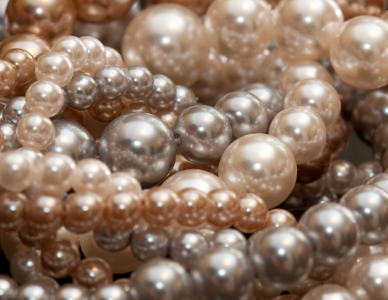
I love the shallow depth of field in this one - not all the pearls are in focus but they don't have to be. You know what they are. It's great that it shows a lot of colour of the pearls themselves. You can have a lot of fun with this type of shot.
So for the first shot, I started with my wife's favourite pair of shoes, although if you ask her they are all her favourite - she wouldn't want any of the other shoes to get jealous ... :-)
I started by trying to recreate the shot exactly and went on from there. Here's where I THOUGHT I ended up:
It's a pretty good shot. I always get my wife to look at my shots before I finalize them - she's my sounding board and has some really different ideas from me creatively. She saw one of my earlier attempts where the pearls slid down the shoe and suggested I use that one, but change it a bit. So, after a little more work I came up with this one.
I like this one better. My wife was right - just don't tell her I said that ...
So on to the shallow depth of field one.
This is where I ended up with that one. Pretty much the same kind of shot, but more pearls than spaces and mine is brighter. Not that it's better, just brighter. I do like it better, but art is very subjective.
Hope everyone enjoyed my "pearls of wisdon"! Ha! See what I did there? Pearls? Hello? Is this thing on? :-)


No comments:
Post a Comment